To make my website more engaging and dynamic I decided to look at using simple animted gifs to show the viewer through the magazine content. I thought this technique worked particularly well especially for the main home page.
Tuesday, 7 June 2011
Images
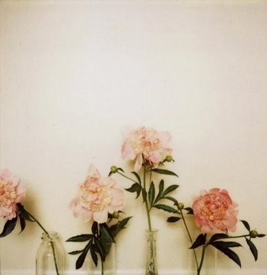
The images I chose to illustrate the site with reflect the whimsical and playful nature and philosophy of the bramble brand and magazine. I tried to keep to a muted colour palette to compliment the visual language of the site. Images were gathered from various websites as well as my own visual archive.
Dropdown Menu
After choosing to go with a horizontal menu structure (from previous user testing) I now had to figure out how to get it working...
Having limited experience in coding something so complicated I looked at several different websites for tutorials on how to make a dropdown horizontal menu.
The ,most useful website I found by far was from the following, and they ultimatley taught me how to create my menu.
http://ago.tanfa.co.uk/css/examples/menu/
http://ago.tanfa.co.uk/css/examples/menu/tutorial-h.html#menref
Having limited experience in coding something so complicated I looked at several different websites for tutorials on how to make a dropdown horizontal menu.
The ,most useful website I found by far was from the following, and they ultimatley taught me how to create my menu.
http://ago.tanfa.co.uk/css/examples/menu/
http://ago.tanfa.co.uk/css/examples/menu/tutorial-h.html#menref
User Testing
User testing for me involved getting peoples opinions about the overall look and functionality of the site.
I ultimatley wanted to find out
Findings
I ultimatley wanted to find out
- Which navigation system (horizonal or vertical) was more appealing to users
- Which navigation system (horizonal or vertical) was easier to use and allowed greater functionality.
- If people could find what they were looking for easily.
- If people found the visuals engaging/appealing.
- Any areas where there was confusion about navigation.
Findings
- People generally preferred the horizontal menu as it didn't impose a heirachy on various catagories and allowed the different headings to be viewed in a clear logical manner.
- Twitter and Facebook logos needed to be used not hidden in the "follow us" section and the blog changed to a heading/link.
- Users related well to the visual language and felt the colour scheme and graphics were clean while still maintaining a feminine feel.
Subscribe to:
Posts (Atom)